Layout editor
In the admin interface there are some setups that requires a layout to be made, e.g. a profile layout or a external database search layout.
Special components
Please note that this section will only describe the generally common components for a layout. There may be special layout components available depending on what extra modules are activated, e.g. Online Preflight.
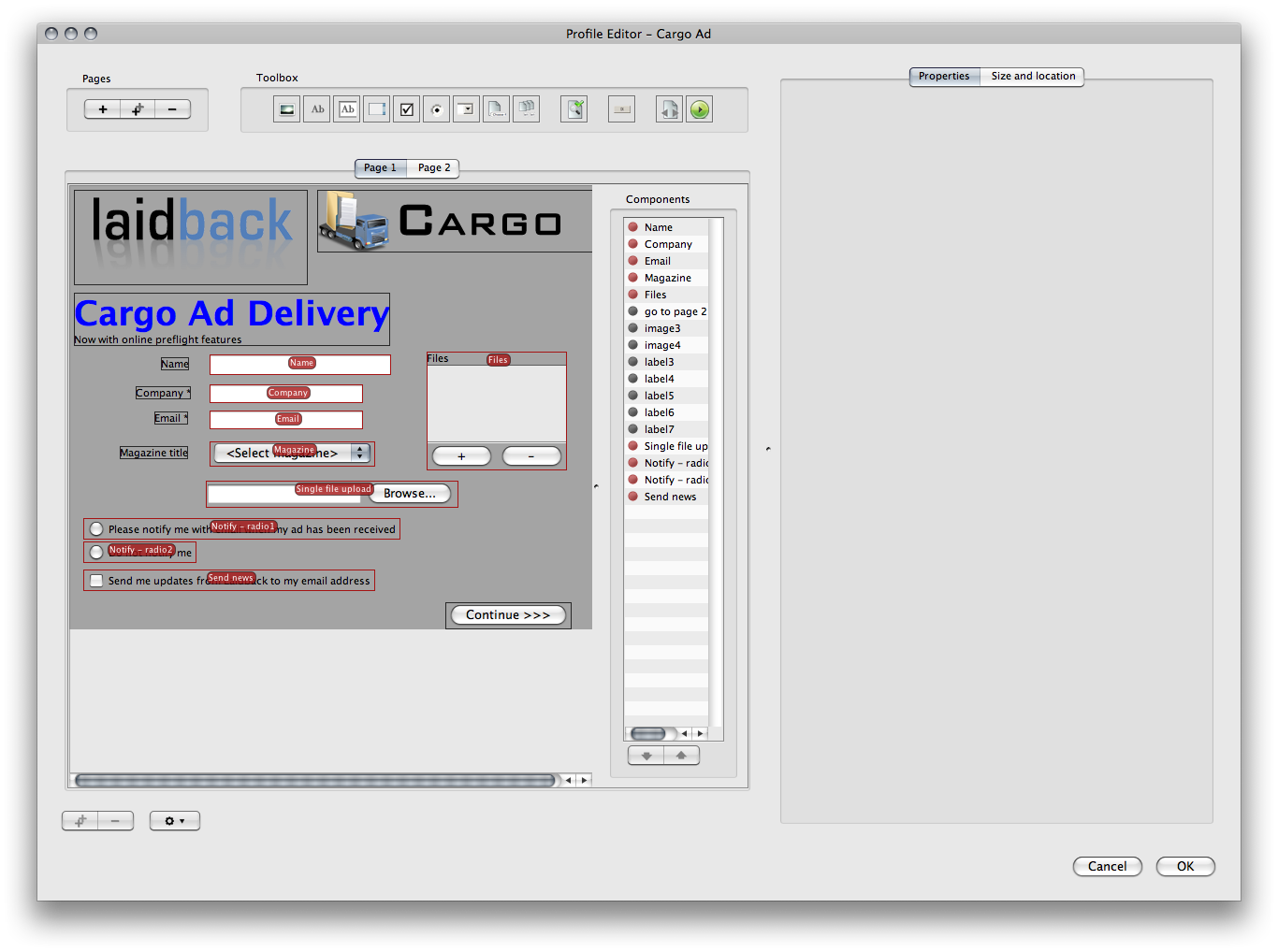
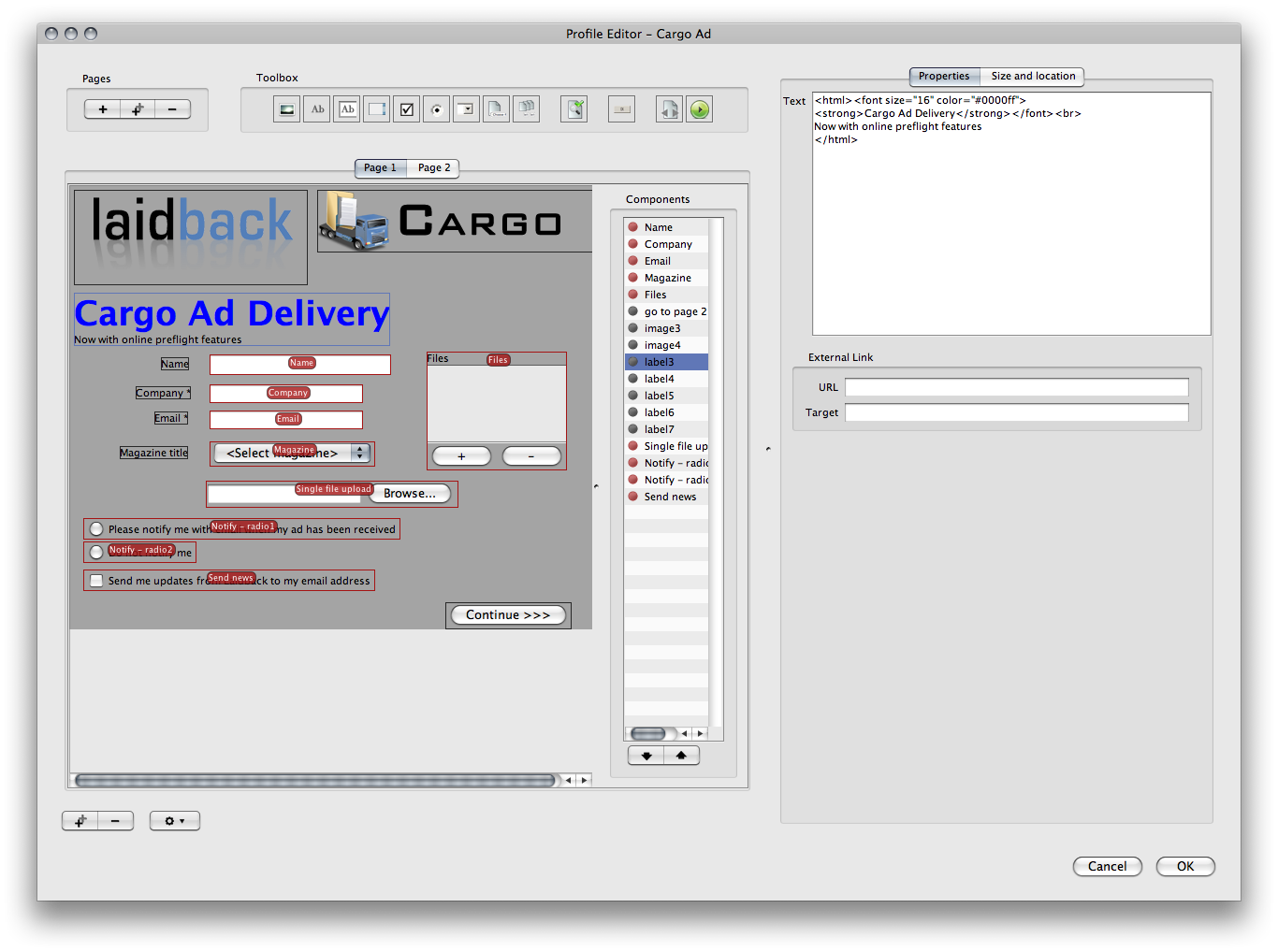
When such a layout is edited a new window is opened with the layout editor. The layout editor has four main areas. The top toolbox bar which contains all the available building tools that may be added to the layout. On the left the building area is located and on the right the properties of the selected component are seen. On the left of the properties the component list is shown if it is selected to be shown (to toggle the visibility, use the setup button below the building area).
The components in the component list may be moved up and down in the list. The input components order in the component list will be the order in which they will be seen in the job properties if this layout is used for a profile.

The layout editor. The toolbar may differ depending on which layout that is edited.
The layout editorPages
Some layouts enables multi-page layouts (e.g. a profile layout). Pages may be added, duplicated and removed with the page control buttons in the upper left corner of the layout editor. Each page is presented in an own tab in the building area. Use the special button component to make it possible to navigate between the pages for the end user.
Components
To add a new component to the layout area you drag the wanted component from the top toolbox and drop it on the area where you would like to add it. Selected components may be moved in the building area either by dragging them or by selecting them and then use the keyboard arrows. To select more than one component hold down CTRL on Windows and CMD on Macintosh when you click on a component. You may also select a group of components by pressing the mouse outside of all components and then hold down the mouse button while dragging and all the components within the visible rectangle will be selected.
When a single component is selected it's properties are seen in the view on the right. The properties have two tabs, the actual component properties and the size and location.
The size and location have four values for the position and size (X, Y, Width and Height). These values are changed automatically if the user moves the component in the building area but they may also be edited directly in the properties view. The width and height may be left without a specific value in case the component's preferred width and height will be used.
The values are changed when value has been changed and the user moves the focus from the current field (for example by clicking the tab key)
Note that if the layout editor is used to layout a profile this profile will for the end user be shown using a flash site which differs from the native OS look and feel. This means that if no specified width and/or height has been specified the result may differ slightly from the layout editor.
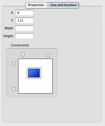
The layout constraints allows the user to see and set the position and size of the component but also set certain constraints.
The constraints setting of a componentBelow the position and size the user may set certain constraints on the component. The constraints that may be set are top, left, bottom and right. If a component is having a constraint it means that the position for that certain constraint will maintain. If you for example wants a certain component to have it's right side at a certain position no matter how wide the component is you select the right side constraint and enter the wanted value.
When a constraint is selected or deselected other values in the position and size area might be set or removed. If you for example set both the left and the right constraint the width of the component is not valid so the value is set to nothing.
Constraints help WYSIWYG
The use of constraints may help to layout the components.
If you for example have some components that you want to justify on their right side you simply use the right constraints with the same value for all the components. This will make sure that the components are lined up in both the Java applet and the Adobe AIR applications.
The layout editor also lets the user set the background of the layout area. This background may not be used depending on which layout that is edited. To change the background select background in the setup button below the building area.
At the top in the background setting window you select the wanted color and below you may set the transparency of the color. At the bottom you will see the result of your selections.
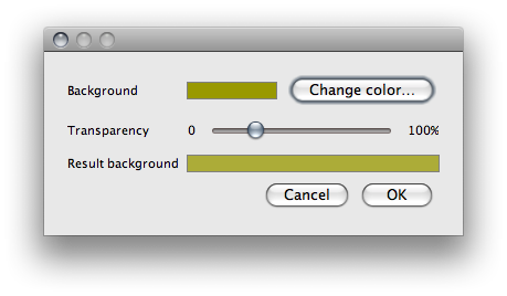
The background setting window for the layout area.
Background setting window for the layout areaLayout components
In the table below all the commonly available components in the layout editor is described. The components' individual property settings are also described. Note that different layout editors may have a different set of the components.
Finding a specific component
The component list may be seen by selecting it in the setup button below the building area. When a component in this list is selcted the corresponding component in the layout will appear as selected.
This feature can be useful for example when a component is placed behind another.
Profile layout components
| Layout components and their individual properties |
 The image component
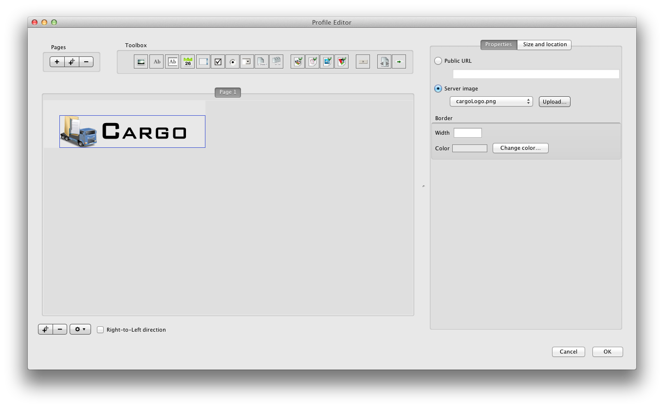
An image is a resource which may show an image.
Please note that if a server image is used (see setting parameter below) in an environment where there are two Cargo servers, the server image must manually be copied from the server to which the admin is connected to the other server (in the same location seen from the cargo webapp root).
| Setting parameter |
Description |
| Public URL |
The full URL address to the image. Note that this URL must be a public available URL for the user that is opening the proflie. |
| Server image |
Select among one of the previously uploaded server images or upload a new image directly from your local disc. |
| Border Width |
An optional border can be placed on the image with this specific width in pixels |
| Border Color |
If a border width is specified the color of that border may be set here |
|
 The label component
A descriptive text is a text which may be used for help text or labeling an input field.
| Setting parameter |
Description |
| Text |
The string that will be displayed. This text may have a HTML text in which case the HTML will be parsed.
If HTML is to be used the text must be surrounded with the tags <html> and </html>. Note that only more simple HTML may be used in the flash page that is the result from the profile layout editor.
HTML restrictions
The HTML text may have show advanced setup in the layout editor. The result flash page however is only able to parse simple HTML, such as bold or italic text, font size and color. Multiple rows, tables and images are not available in the flash page even if it may look ok in the layout editor.
|
| URL |
If this field has a value the label will be a clickable link to the location entered in this field, e.g. http://www.server.com/linkpage.html. |
| Target |
If the external link is specified the link target is the ID of the target window where the link will be opened. |
|
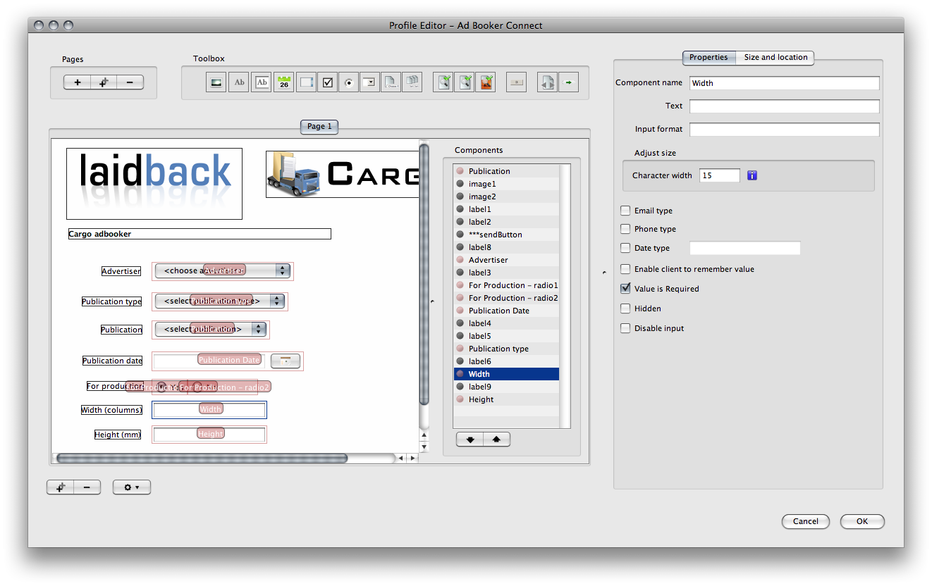 The text component
The text input component is a text field where the user may enter text.
| Setting parameter |
Description |
| Component name |
This is the name of the component. If this layout is used in a profile this is the actual name of the job property that will be created when a user sends data through this profile. |
| Text |
The default text that initially will be present in this component. |
| Input format |
This field may be used to enter a regular expression defining the input format that must be met for the field.
Read more about the regular expression format that is used at http://livedocs.adobe.com/flex/3/html/help.html?content=12_Using_Regular_Expressions_03.html
Regular expression for email addressed
If you want to make sure that a user is entering a valid email address format use the following regular expression in the input format field:
(\w|[_.\-])+@((\w|-)+\.)+\w{2,4}+
|
| Character width |
The number of columns that will be used to specify the width for this field. Note that if a layout constraint is set this value may be omitted.
Note that the component column width differs if the layout component is to be visible in a flash page or java applet. |
| Email type |
If this checkbox is selected the value from this field will be regarded as an email address and the staff user when searching the Cargo system will see the value from this field as an email address which will be enabled to send emails to directly in the search interface. |
| Phone type |
Similar effect as the email type with the only differnce that the staff user will be able to do a skype call directly from the search interface. |
| Date type |
Select this and set the format of the date if this field should be a date field. |
| Enable client to remember value |
If this checkbox is selected the user who enters values in the layout component will be enabled to remember these values. In a profile layout the Cargo Form uses cookies to remember values and the Cargo Sender application saves the values locally on the user's computer. |
| Value is required |
If this checkbox is selected he user has to enter a value into this field. If this layout is a profile layout the end user will not be able to send the form to the Cargo server unless a value has been entered into this component. |
| Hidden |
If this option is selected the component will not be visible for the end user. |
| Disable input |
If this option is selected the value in this component will not be able to edit for the end user. |
|
The date input component.
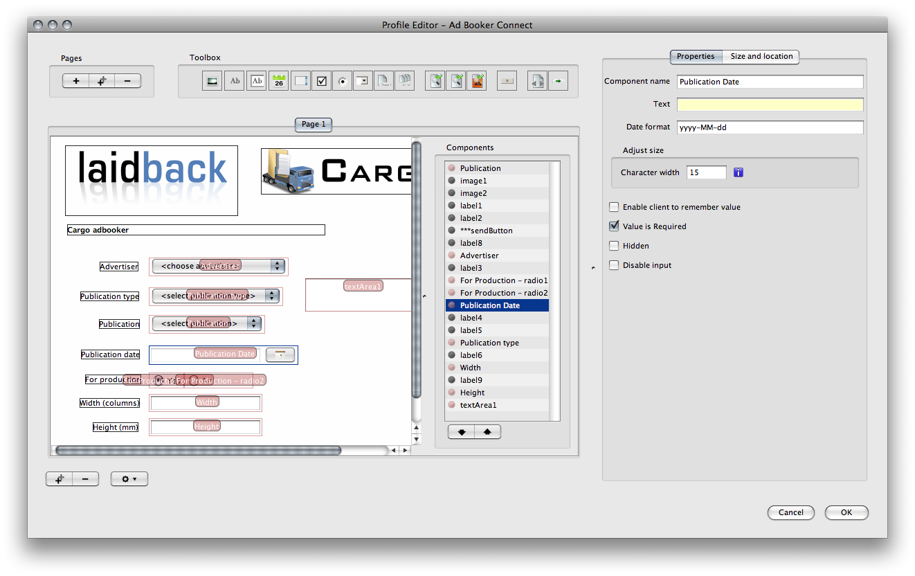
The date input componentThe date input component is a special text field component with an additional date selector button. Beside setup common to the text field input the following settings are available.
| Setting parameter |
Description |
| Date format |
The format of the date that is set in this component. |
|
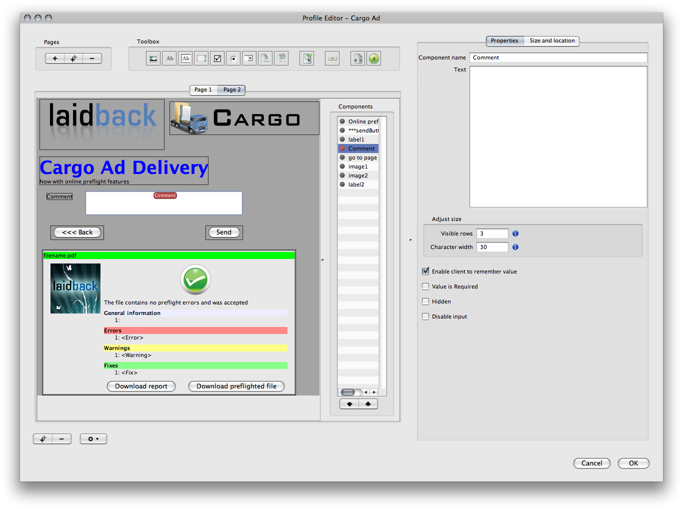 The text area component
The text area input component is similar to the text input with the only difference that this component may have multiple rows visible. See the text input component for the settings not mentioned below.
| Setting parameter |
Description |
| Visible rows |
The number of rows that will be used to specify the height for this component. Note that if a layout constraint is set this value may be omitted.
Note that the component column width differs if the layout component is to be visible in a flash page or java applet. |
|
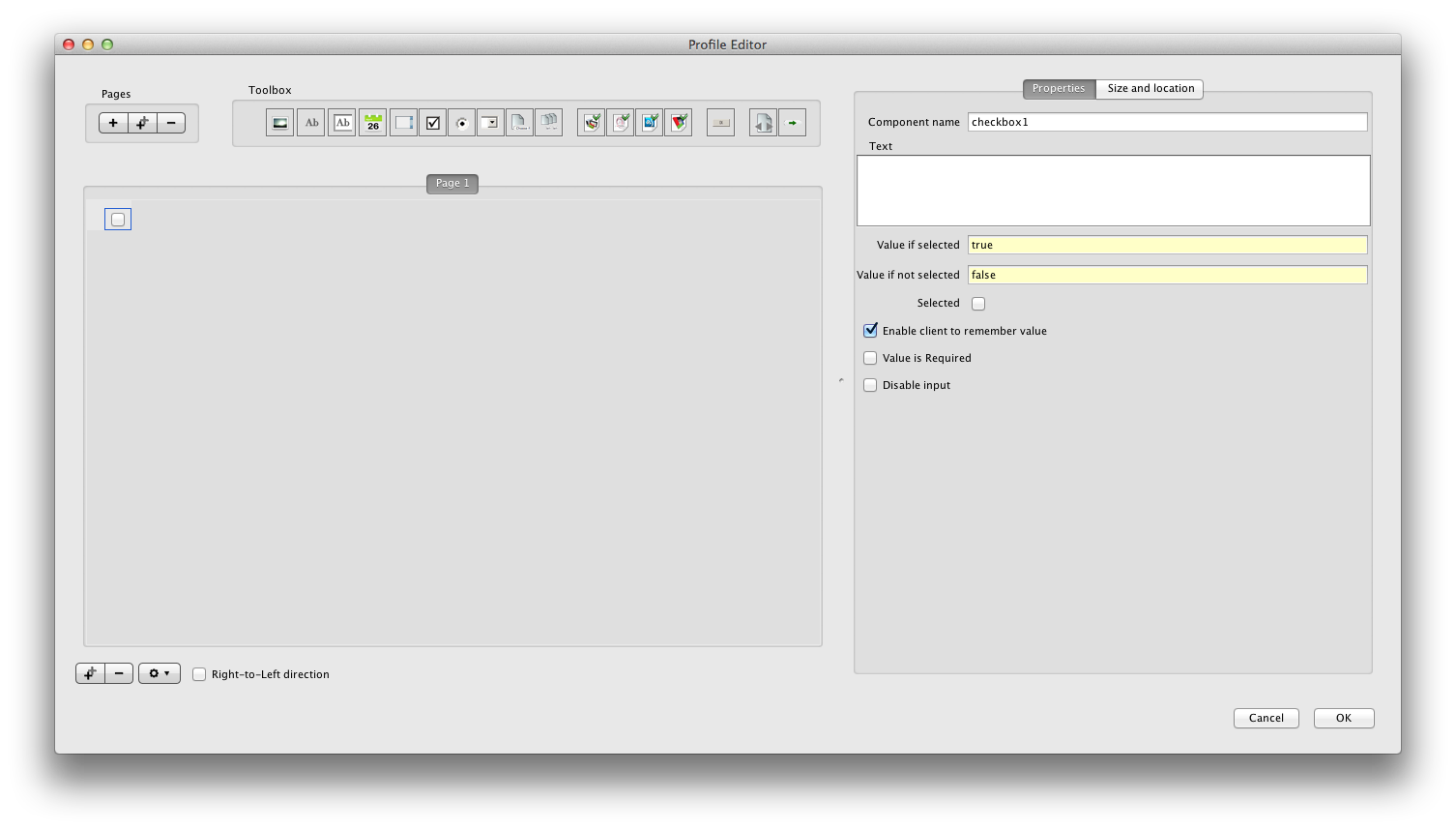 The checkbox component
The checkbox is a component that may be selected or not by the user.
| Setting parameter |
Description |
| Component name |
This is the name of the component. If this layout is used in a profile this is the actual name of the job property that will be created when a user sends data through this profile. |
| Value if selected |
The value that will be passed if this checkbox is selected |
| Value if not selected |
The value that will be passed if this checkbox is not selected |
| Text |
The visible text connected to this component. |
| Selected |
The initial state of the checkbox. |
| Enable client to remember value |
If this checkbox is selected the user who enters values in the layout component will be enabled to remember these values. In a profile layout the Cargo Form uses cookies to remember values and the Cargo Sender application saves the values locally on the user's computer. |
| Value is required |
If this checkbox is selected he user has to select this checkbox component. If this layout is a profile layout the end user will not be able to send the form to the Cargo server unless this checkbox component has been selected. |
| Disable input |
If this option is selected the value in this component will not be able to edit for the end user. |
|
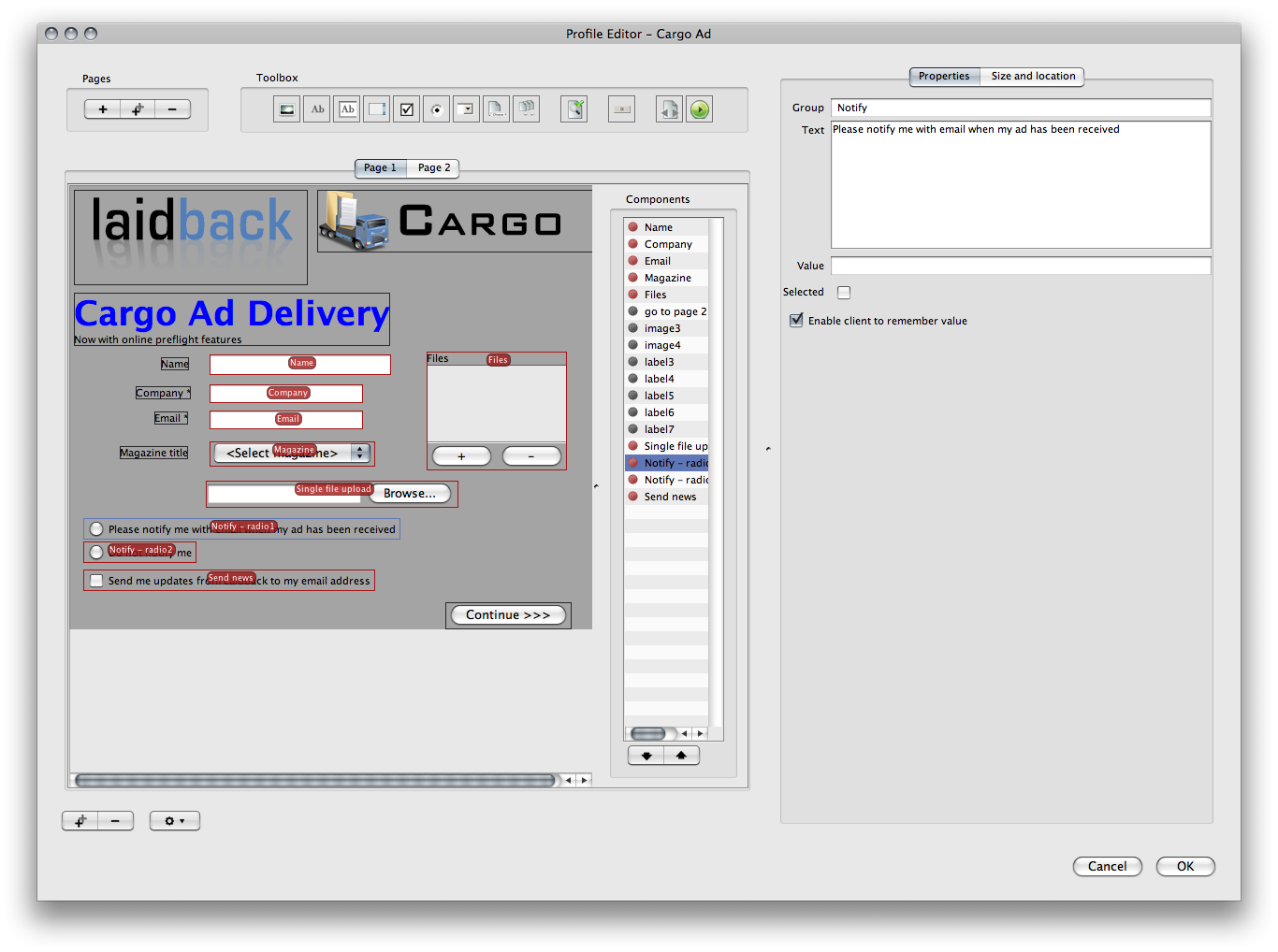
The radio checkbox component.
The radio checkbox componentThe radio checkbox is similar to the regular checkbox with the difference that the radio checkbox belongs to a specific group. Only one radio checkbox in the same group may be selected by the user.
Radio checkbox ID
Note that radio checkbox ID's is not used. The ID that is used is taken from the group setting in the radio checkbox.
| Setting parameter |
Description |
| Group |
The group that this radio checkbox is a member of. Other radio checkboxes with the same group membership will be controlled so that only one of these checkboxes may be selected by the user.
This value will be used in the same matter as the component name of other input components. The value from the selected radio button in the group will be saved as the job property with the group name if this component is used in a profile. |
| Text |
The visible text connected to this component. |
| Value |
The value that will be used as meta data if this radio button is selected. The meta data key will be the group name of this component. |
| Selected |
The initial state of the checkbox. |
| Enable client to remember value |
If this checkbox is selected the user who enters values in the layout component will be enabled to remember these values. In a profile layout the Cargo Form uses cookies to remember values and the Cargo Sender application saves the values locally on the user's computer. |
|
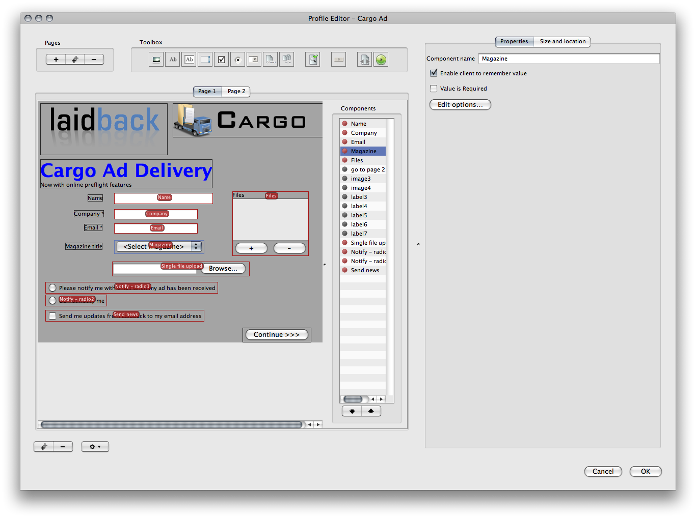
The popup component |
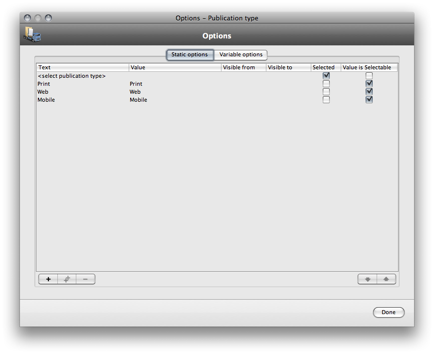
The popup option setup |
The popup (or dropdown) input component is a list of values where one value may be selected by the user.
The option setup is divided in two parts, static and variable options. The static options will always be visible (note, setting the visible from or visible to may prevent a static option to show). The variable options depends on values from other components in the layout. If the dependent component has a certain value, the variable options may be visible or not.
| Setting parameter |
Description |
| Component name |
This is the name of the component. If this layout is used in a profile this is the actual name of the job property that will be created when a user sends data through this profile. |
| Enable client to remember value |
If this checkbox is selected the user who enters values in the layout component will be enabled to remember these values. In a profile layout the Cargo Form uses cookies to remember values and the Cargo Sender application saves the values locally on the user's computer. |
| Value is required |
If this checkbox is selected he user has to enter a value into this field. If this layout is a profile layout the end user will not be able to send the form to the Cargo server unless a value has been entered into this component. |
| Edit options |
Opens the option dialog where the options may be changed. Each option has some settings seen below. |
| Option parameter |
Description |
| Text |
The actual text that will appear for the user in the poup. |
| Value |
The value that is set as the meta data value if this option is selected. |
| Visible from |
The optional date from which this option is visible |
| Visible to |
The optional date to which this option should be visible. If set the option will not be visible if the computer system date is after this date. |
| Selected |
If this is selected this option will be initially selected. Since only one option may be selected the first option where this checkbox is selected will be selected. |
| Value is selectable |
If this checkbox is selected this option is in fact selectable for the end user. If this checkbox is not selected the option is not a valid option if the 'Value is required' setting for this component is set to true. |
|
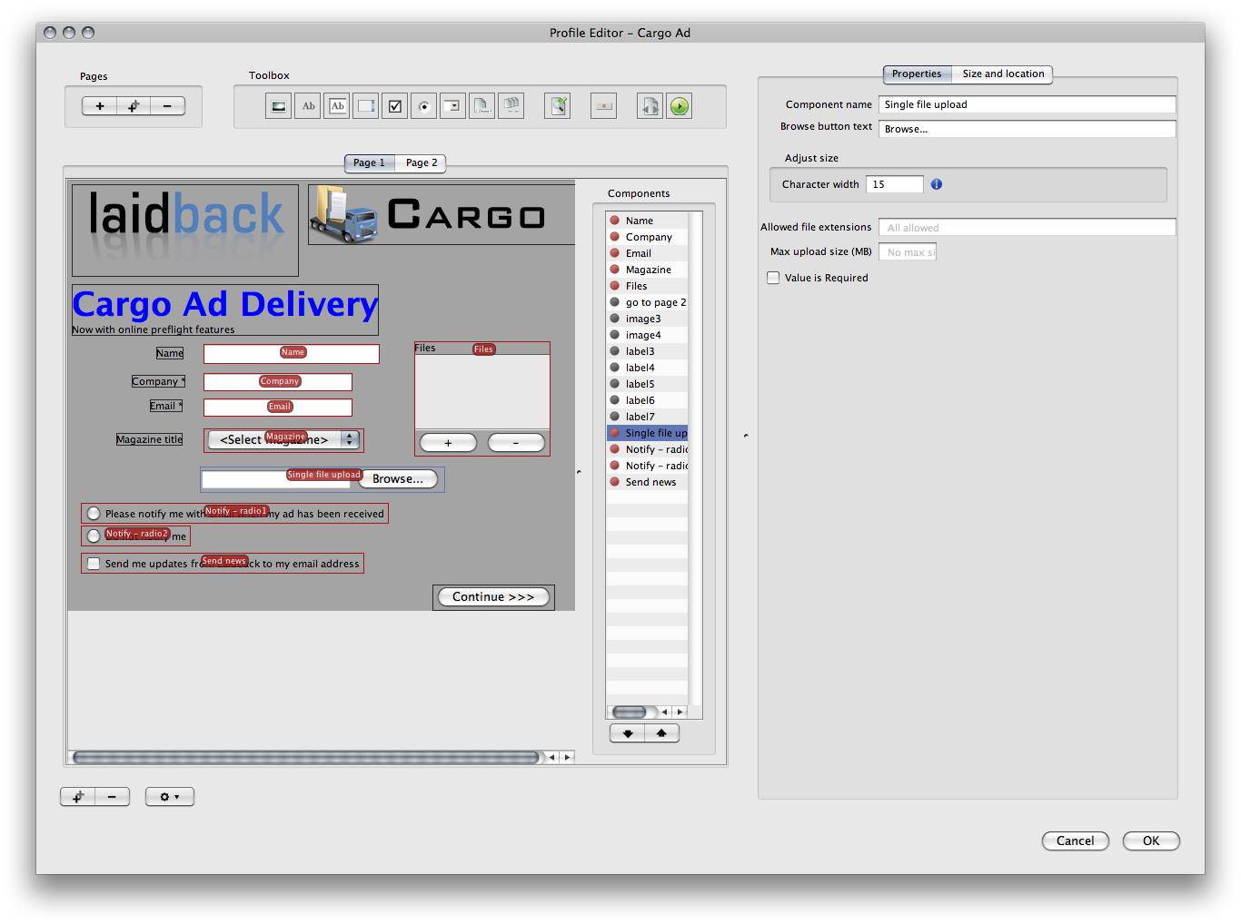
The file upload component.
The file upload componentThe file upload component is a text input where a file path will be visible and a browse button where the user may select a file. The component will cause the selected file to be uploaded to the Cargo system. You may have more than one file upload in the same profile.
| Setting parameter |
Description |
| Component name |
This is the name of the component. If this layout is used in a profile this is the actual name of the job property that will be created when a user sends data through this profile. |
| Browse button text |
The text for the browse button. |
| Character width |
The number of columns that will be used to specify the width for this input field. Note that if a layout constraint is set this value may be omitted.
Note that the component column width differs if the layout component is to be visible in a flash page or java applet. |
| Allowed file extensions |
This field is used to restrict the availble files that can be entered in this field to a certain file extension. If several different file extensions should be allowed, separate them with comma.
If the input should be restricted to only jpg or tiff files you may enter jpg, tiff, tifi in this field. |
| Max upload size |
If selected the user may not upload files that are bigger than the specified number of MiB. Note that the size restriction is set per file upload component. |
| Value is required |
If this checkbox is selected he user has to enter a value into this field. If this layout is a profile layout the end user will not be able to send the form to the Cargo server unless a value has been entered into this component. |
|
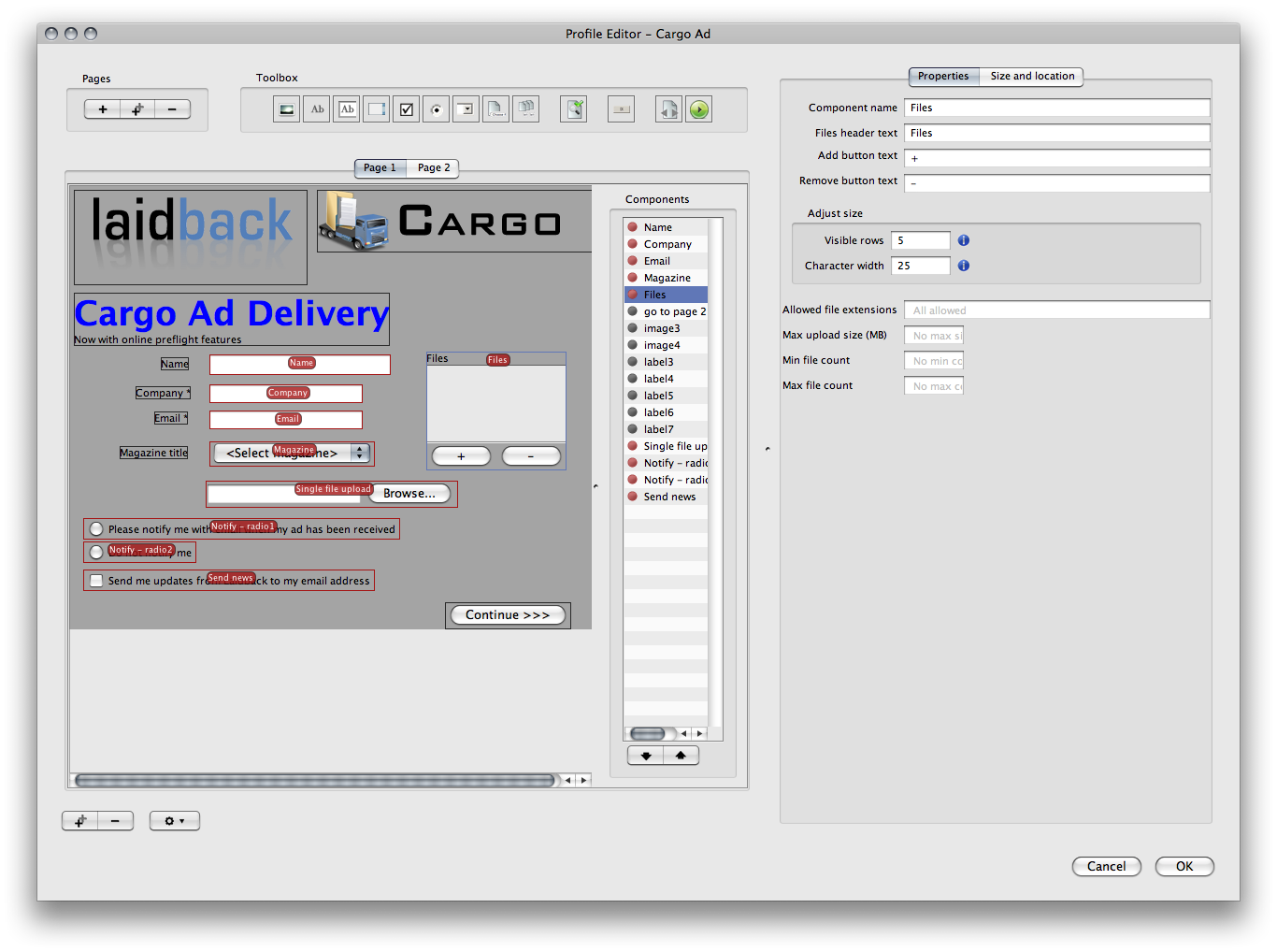 The file list component
The file list is similar to the file upload but the user may select more than one file for the file list.
| Setting parameter |
Description |
| Component name |
This is the name of the component. If this layout is used in a profile this is the actual name of the job property that will be created when a user sends data through this profile. |
| Files header text |
The text above the file list. |
| Add button text |
The text on the add button below the file list. |
| Remove button text |
The text on the remove button below the file list. |
| Visible rows |
The number of visible rows in the list. Note that if a layout constraint is set these values may be omitted.
Note that the component column width differs if the layout component is to be visible in a flash page or java applet. |
| Character width |
The number of columns that will be used to specify the width for this input field. Note that if a layout constraint is set this value may be omitted.
Note that the component column width differs if the layout component is to be visible in a flash page or java applet. |
| Allowed file extensions |
This field is used to restrict the availble files that can be entered in this list to a certain file extension. If several different file extensions should be allowed, separate them with comma.
If the input should be restricted to only jpg or tiff files you may enter jpg, tiff, tifi in this field. |
| Max upload size |
If selected the user may not upload files that together are bigger than the specified number of MB. Note that the size restriction is set for the whole list and apply to the sum of the files in this particular file list. |
| Min file count |
If a number is entered this is the minimum number of files that must be entered into this list. |
| Max file count |
If a number is entered this is the maximum number of files that can be entered into this list. |
|
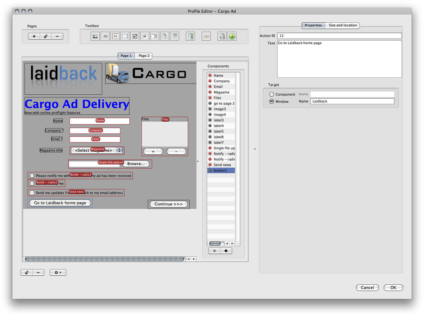
The action button component.
The action button componentThe action button component may be used in a profile layout to execute a certain action set in the Cargo system.
| Setting parameter |
Description |
| Action ID |
The ID of the action set to execute when this button is clicked. |
| Text |
The visible text for the button. |
| Target |
When the execution of the action set is made this action set may return a text or other value. The target is where to place this returned value.
If the component radio button is selected the ID of a specific component in the layout should be entered. This component will get the returned value as it's value.
If the window radio button is selected the returned value will be shown in a browser window. The name is the named ID for this window. |
|
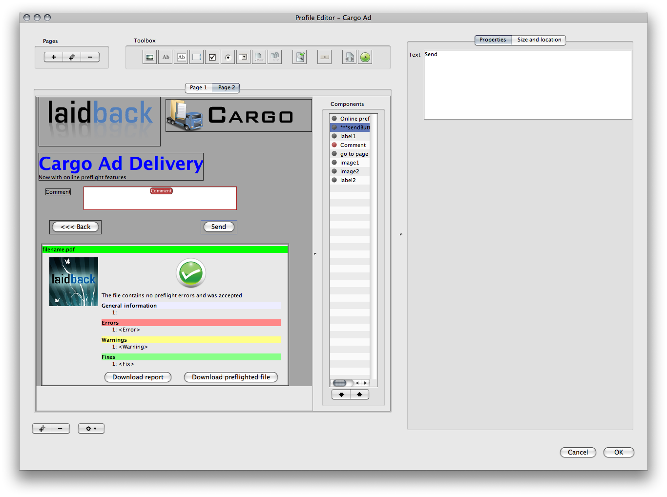
The send button component.
The send button componentThe send button component is the button that will be used to send a profile data to the Cargo system. This component is only present in the profile layout.
| Setting parameter |
Description |
| Text |
The visible text for the button. |
Note
If a send button is missing in the profile form the user will not be able to send the data to the Cargo system.
|
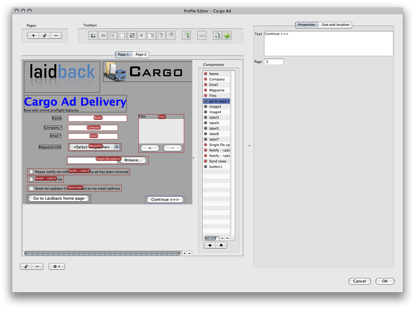
The go to page button component.
The go to page button componentThis special button component is used to change the page of the layout for the end user.
| Setting parameter |
Description |
| Text |
The visible text for the button. |
| Page |
The page number to go to if this button is pressed. |
|
